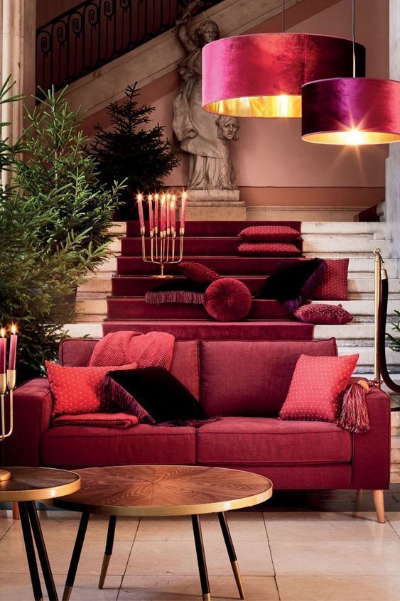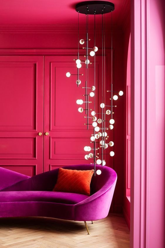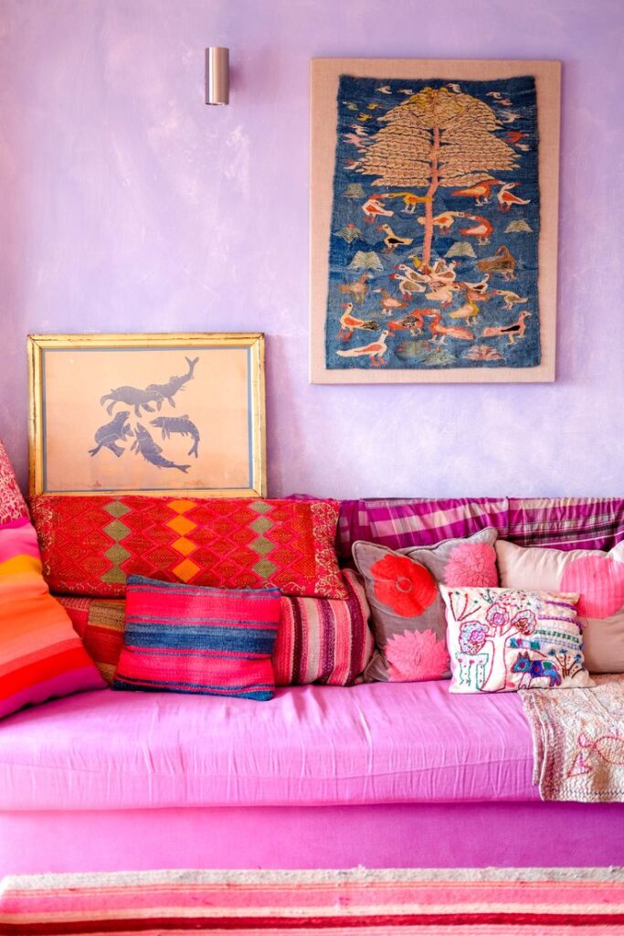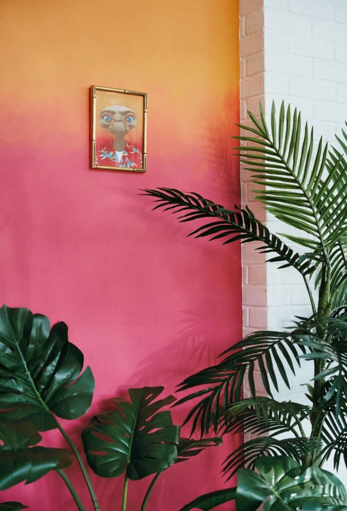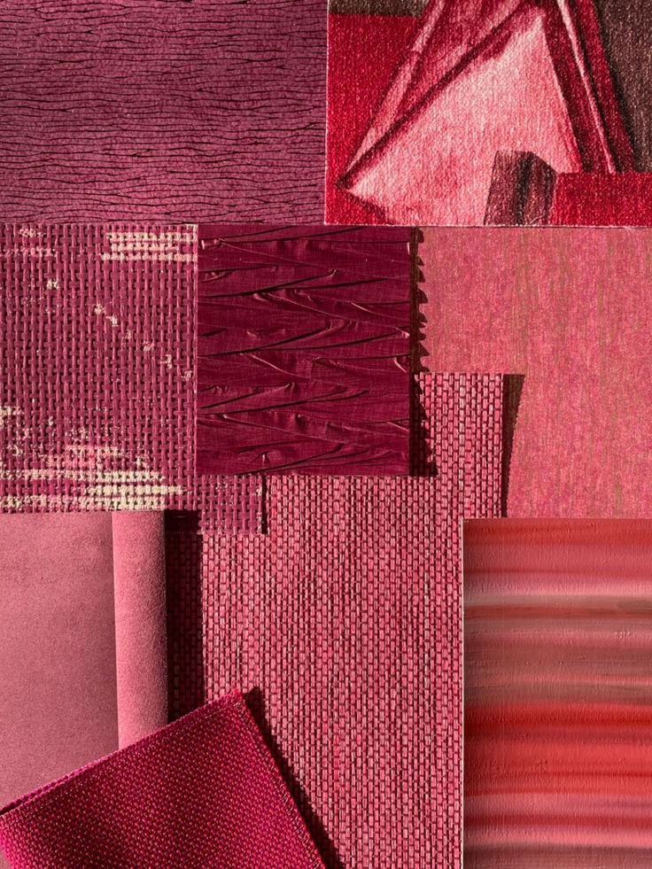
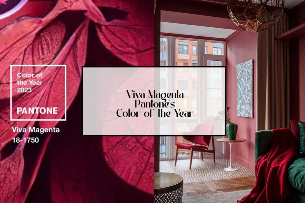
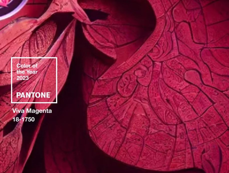
Pantone announced that its 2023 Color of the Year is Viva Magenta. They described the shade as a “crimson red tone that presents a balance between warm and cool.”
They highlight a color each year to reflect current culture, and the brand said Viva Magenta is a “hybrid” shade that’s symbolic of our existence in the physical and digital world.
It got us wondering how different factors can influence the popularity of a particular color, for example, is a color trendy because of industries? Is it cultural or societal?
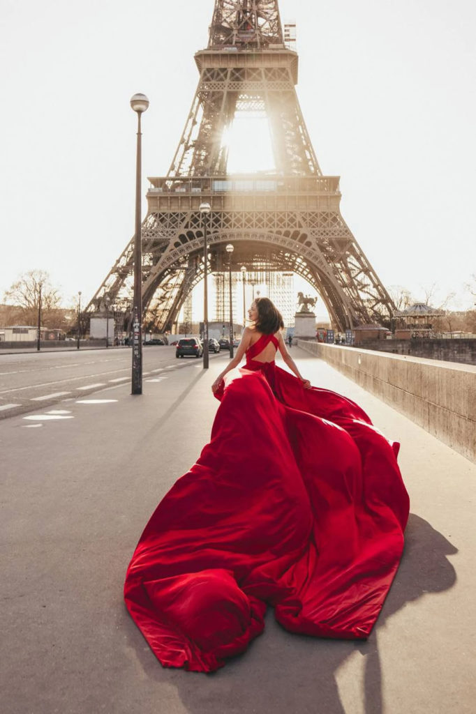
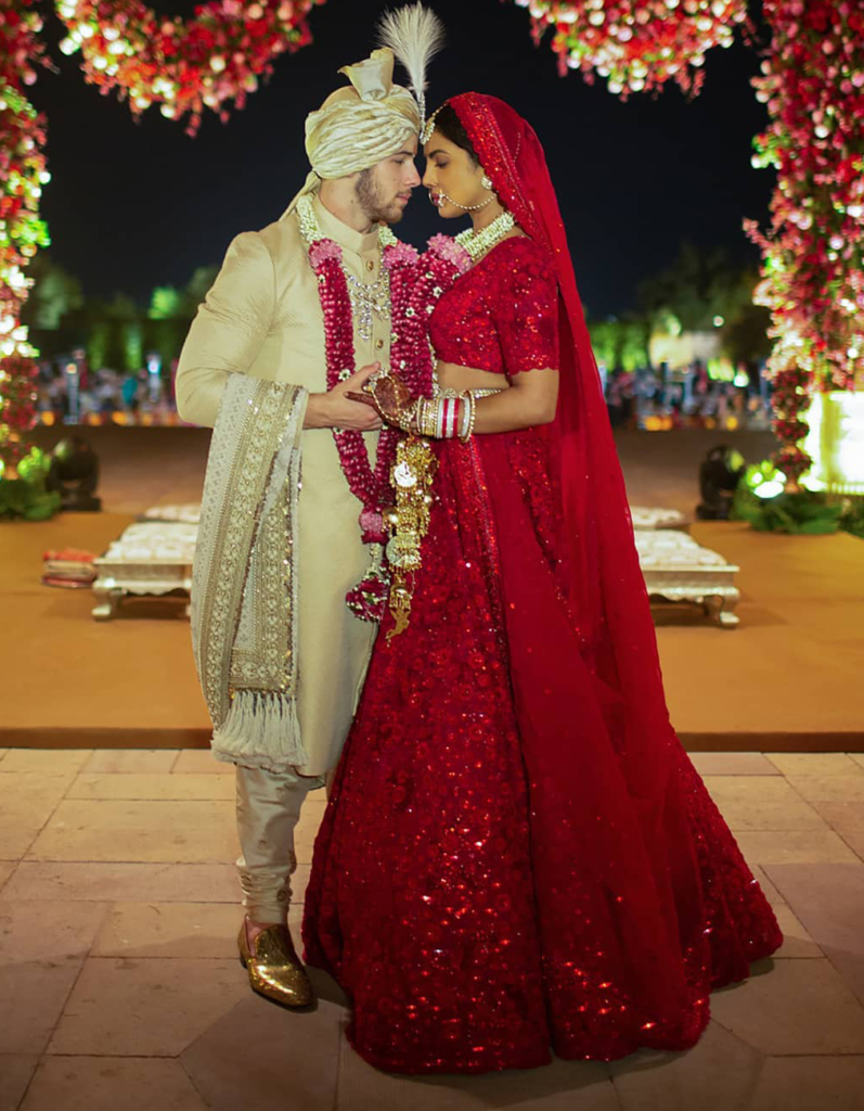
I mean, in a lot of Eastern cultures, red is a lucky and auspicious color, and it is often worn during important events and celebrations. On our Western culture it would look really strange to see, for example, a bride walking down the aisle wearing a red dress.
While this red wedding dress is dramatic, and striking, look how natural Priyanka Chopra looks in her gorgeous res dress (Sabyasachi Lehenga) for her Hindu wedding :
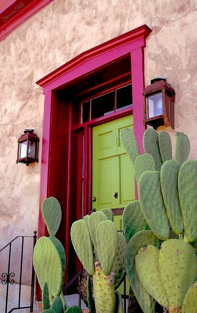
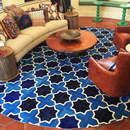
In many Mediterranean and Latin American cultures, vibrant and bold colors are commonly used in interior design. This is often reflected in the use of bright reds, yellows, and oranges, which are thought to bring warmth and energy to a space.
During the mid-20th century, the minimalist movement emerged as a reaction to the excess of the previous decades. This movement was reflected in a preference for clean, simple, and uncluttered spaces, often featuring neutral colors like white, beige, and grey.
During the 1960s and 1970s, the “hippie” or “flower power” movement was considered countercultural in the United States, as they rejected mainstream values and embraced a more rebellious and expressive style. This movement was reflected in the popularity of bright and bold colors, such as hot pink, neon green, and electric blue.
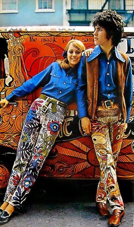
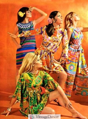
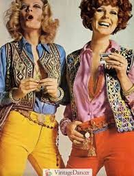
The bold and bright colors popular during this time were often used in clothing, art, and interior design to express the values of the movement.
So, color definitely makes a statement and sets up our mood. But how does the industry work around this?
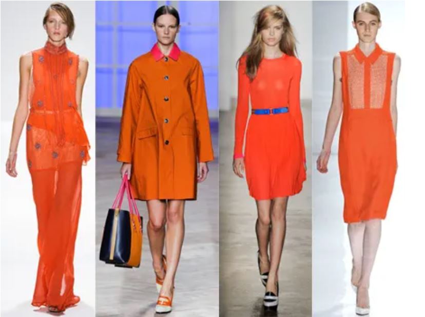
The fashion industry is always looking for new and innovative ways to stand out, and this can include introducing new colors or reviving old ones. For example, in the early 2010s, the color “Tangerine Tango” was chosen as the Pantone Color of the Year, and it became very popular in fashion and interior design.
Even though cultures and regions will definitely have different preferences for color, just like in the fashion industry, color trends in interior design can be influenced by design bloggers, home design magazines, and home decor companies.
Many times if a popular blogger or magazine features a home decorated in a particular color scheme, that color scheme may become more popular among their followers and readers. (Apartment Therapy, anyone..?)
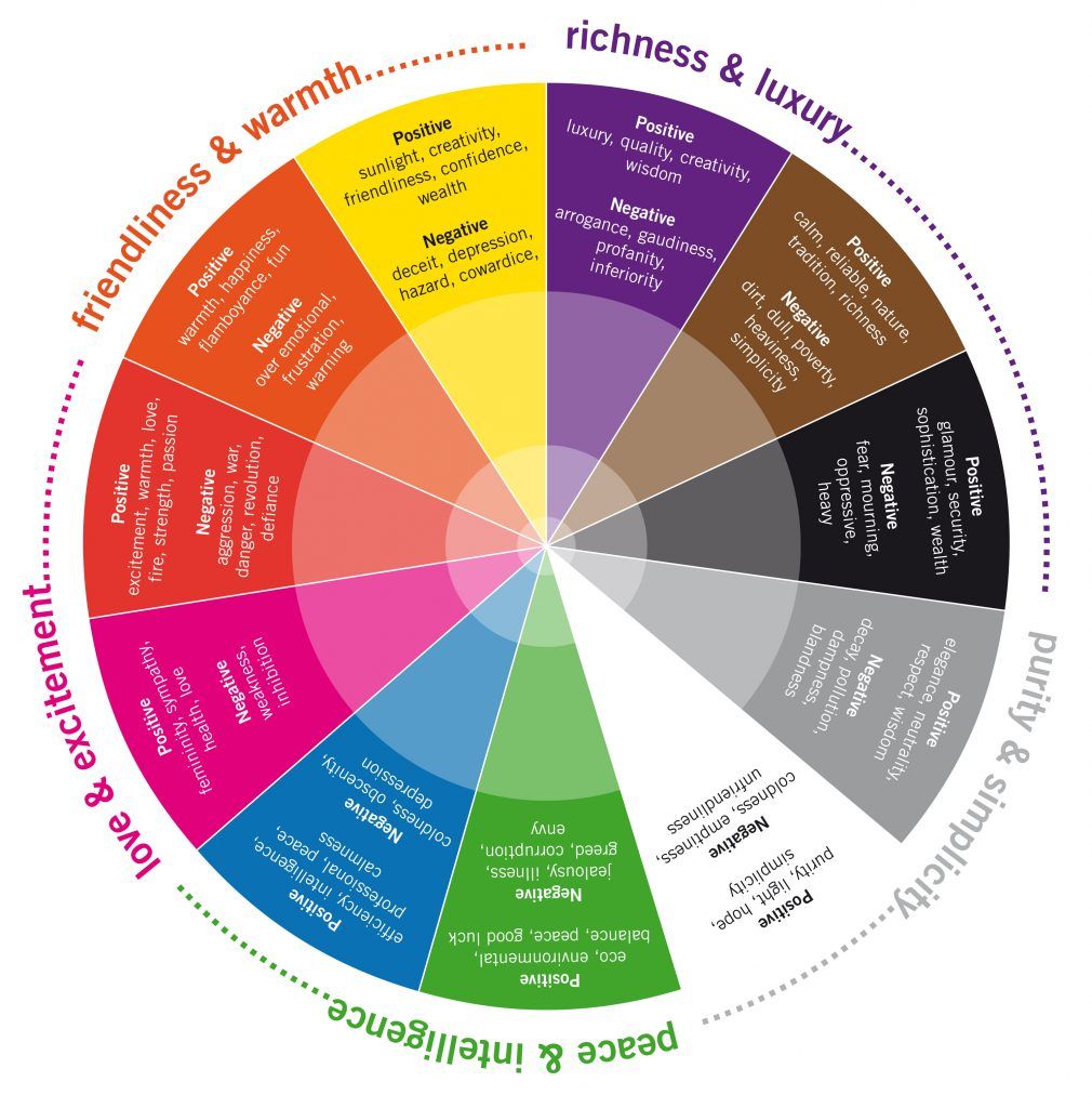
The Psychology of Color
Colors can have a psychological impact on people, which can influence their popularity in interior design. For example, colors like blue and green are often associated with calmness and relaxation, while bold colors like red and yellow can create a sense of energy and excitement.
Here’s a small list of symbolic meanings that are often associated with different colors:
- Red: Passion, excitement, love
- Pink: Soft, reserved, earthy
- Purple: Mysterious, noble, glamorous
- Blue: Wisdom, hope, reason, peace
- Green: Nature, growth, freshness
- Yellow: Hope, joy, danger
- Orange: Warmth, kindness, joy
- White: Truth, indifference
- Black: Noble, mysterious, cold
Overall, the popularity of a particular color in interior design can be influenced by a wide variety of factors, including geographic location, psychological factors, trends in other design industries, and technology.
Bottomline, as we always recommend, go with your gut. Listen to yourself and what YOU like. It might not always be in style or hip, and you may certainly be influenced by your surroundings (we live in a society after all), but don’t let that kill your vibe!
Be yourself and let your colors, spaces and decisions show your personality and shine through!
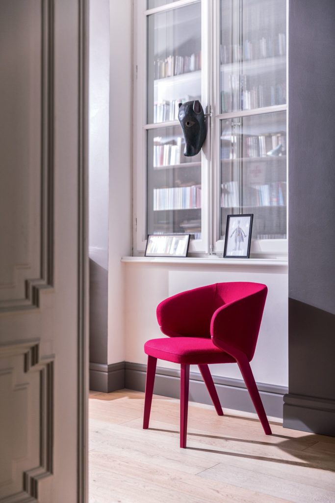
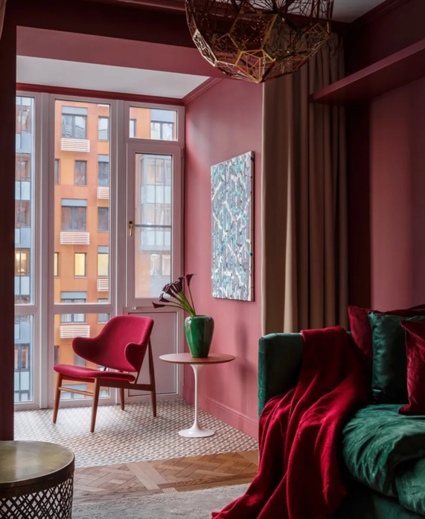
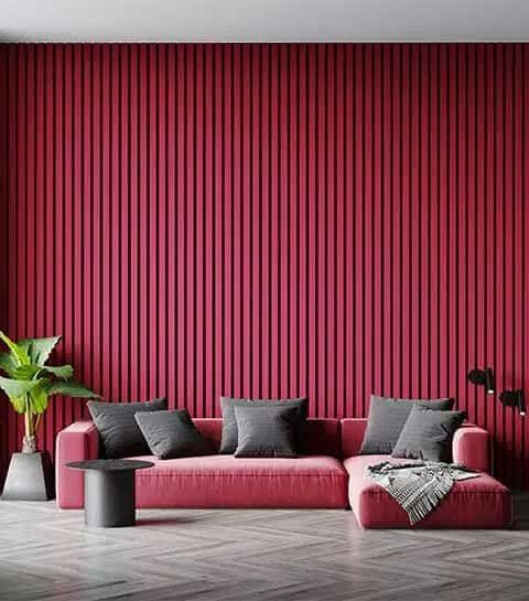
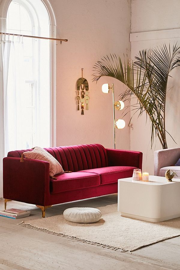
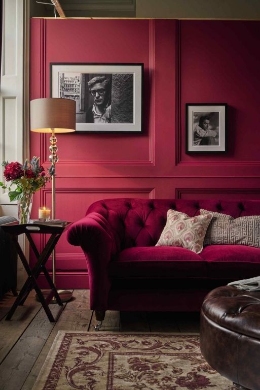
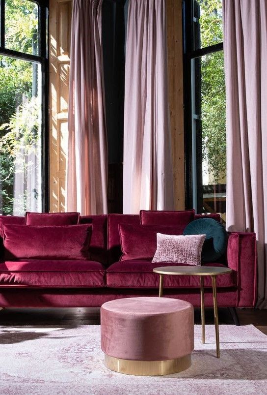
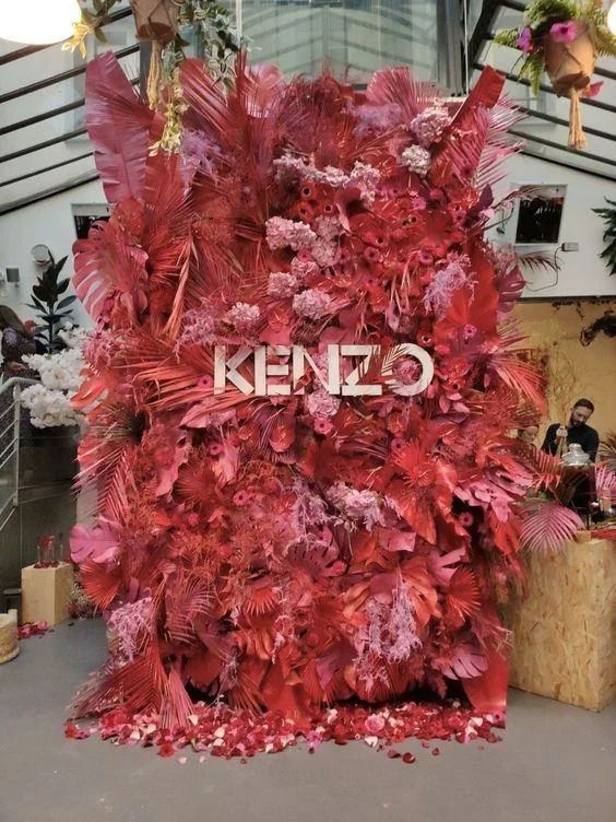
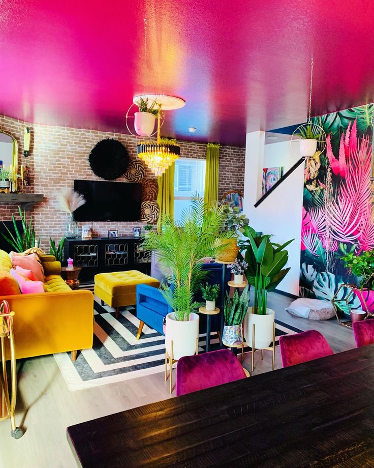
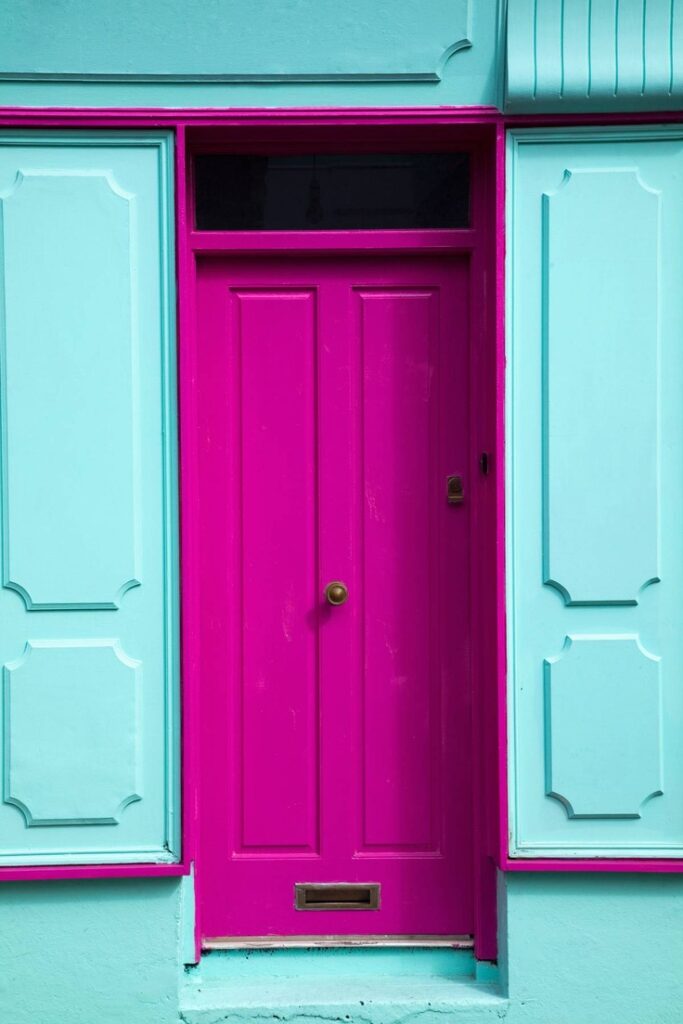
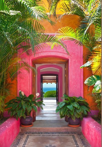
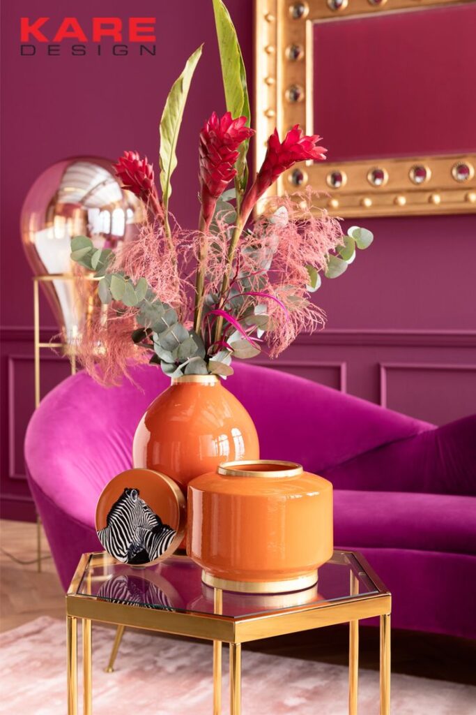
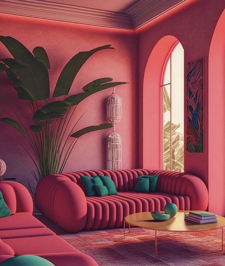
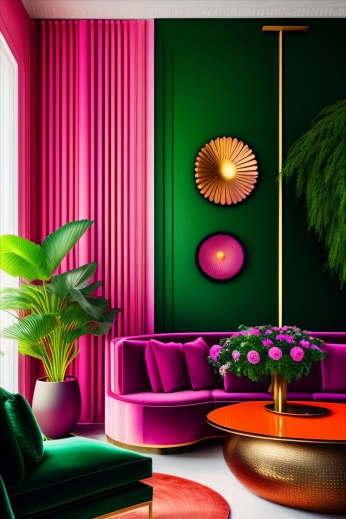
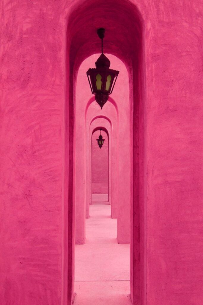
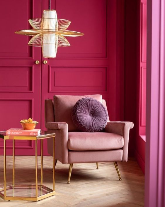
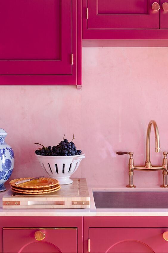
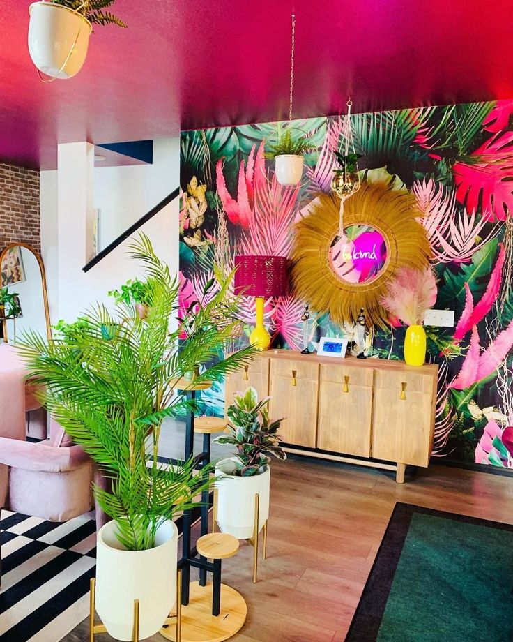
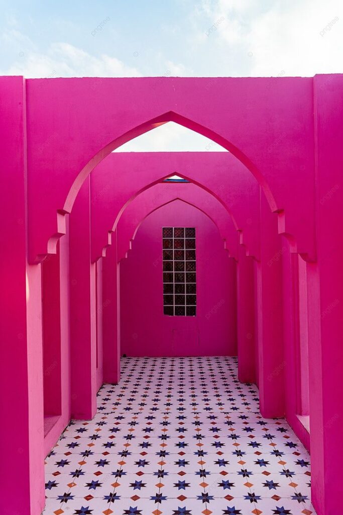
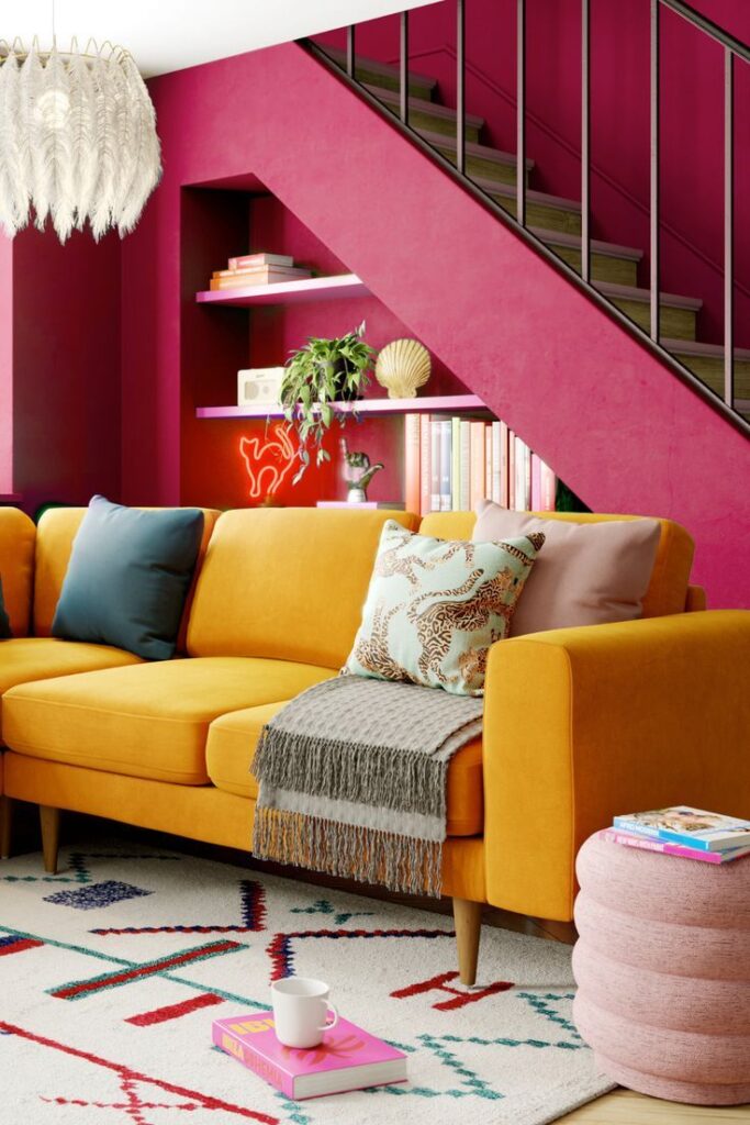
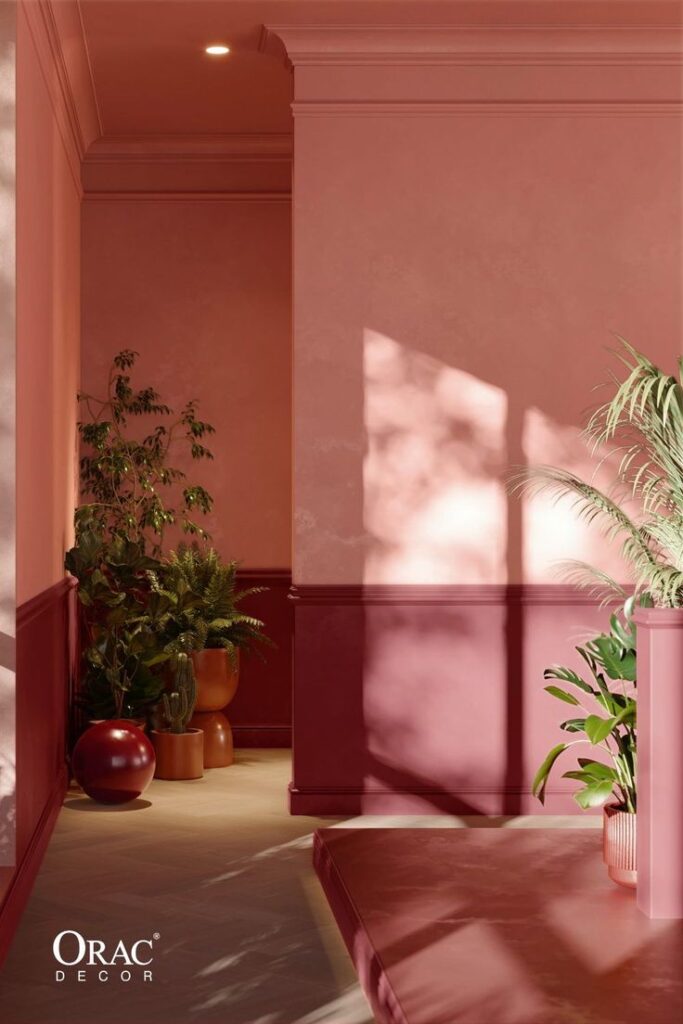
In any case, if you were wondering how to use Viva Magenta in your interiors, here’s some inspiration from our Pinterest boards: